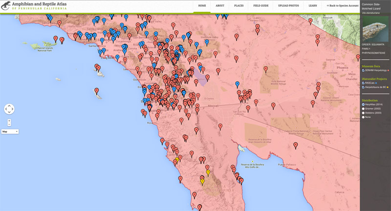
Distribution Maps
The distribution maps used in the Amphibian and Reptile Atlas of Peninsular California are intended to provide a general understanding of where any one species lives.
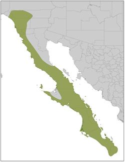
Species Distribution Polygons...
Distribution maps depicting the range of a species have traditionally been produced by developing a minimum convex polygon around presence data (e.g., museum specimens, visual observations) with the assumption that gaps in the data are regarded to have the species present, provided that there is suitable habitat. While the polygons rely on presence data, they also rely on expert opinion. Biases are inherent in this process. Biases increase with sample size and are affected by the complexity of the habitat, the error associated with recording a specimen's location, and the spatial and temporal distribution of the sampling effort.
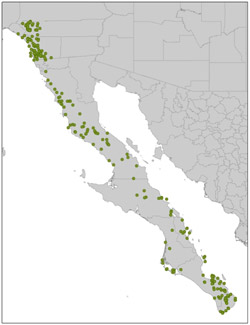
Dot Distribution Maps...
Dot distribution maps use presence data to depict the occurrence of a species across the region without making assumptions regarding sampling gaps. Biases also exist, but are confined to the magnitude of the extent error associated with the location of each point. A locality recorded with a handheld gps has a relatively small error (~3 m), while historical descriptive localities converted to a latitude and longitude usually have a larger error (~1 km). Other errors can also mislead our understanding of a distribution and include a misidentified specimen, a mis-assignment of a location with a commonly used place name (e.g., which Agua Caliente are they referring to?), and mistakes made when georeferencing.
Atlas Mapping Interface...
Our mapping interface uses base maps from Google (Google Maps JavaScript API v3) with customized overlays depicting both our own understanding of a species distribution and polygons from a number of published sources (presented as .kmz files). Distribution polygons from published sources are not exact representations of their original maps. These shapes have been altered by georeferencing the original maps onto the more detailed digital maps available today. This process often involves stretching the map in various ways to make it correspond to the same features displayed on the digital map. It was also never the intent of the authors of printed distribution maps to show them at the scale which is available with interactive mapping on the computer. Data sources include direct links to both museum data and citizen science observations from projects in iNaturalist.org. Both sources come with their own biases and any errors in taxonomic assignment or the placement of locations will be cleaned up on an ongoing basis. It is our belief that crowdsourcing the validation of biodiversity data will help speed up the process. There are also many additional sources of biodiversity data, which should be consulted. In the meantime, please refer to our Terms and Conditions; we are not liable for errors presented within this website, we know they exist, and we will be working to remove all errors from our databases.